
I shot this house last year in Winston Salem, NC when we were heading to the mountains.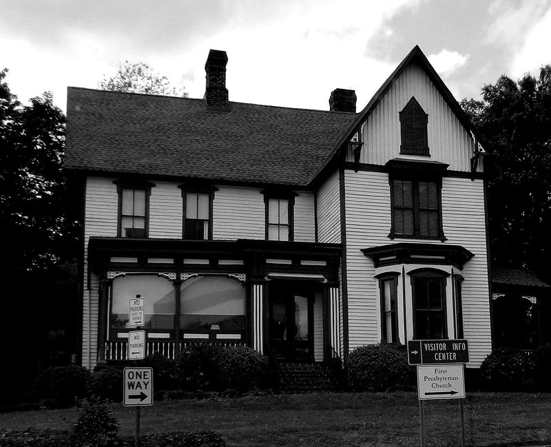
I liked the strong lines of the house for black and white but didn't like the signs in front. However, I don't think I like the shot as well cropped so I'm posting both versions.![]()

Click for the home of the weekend in black and white.

Translate
Blog Archive
-
►
2024
(1)
- ► February 2024 (1)
-
►
2022
(1)
- ► February 2022 (1)
-
►
2021
(3)
- ► November 2021 (1)
- ► March 2021 (1)
-
►
2020
(5)
- ► December 2020 (1)
- ► March 2020 (1)
- ► February 2020 (1)
-
►
2019
(6)
- ► December 2019 (1)
- ► October 2019 (1)
- ► August 2019 (1)
- ► April 2019 (1)
- ► March 2019 (1)
-
►
2018
(8)
- ► December 2018 (1)
- ► November 2018 (1)
- ► September 2018 (1)
- ► August 2018 (1)
- ► April 2018 (1)
- ► March 2018 (1)
- ► January 2018 (1)
-
►
2017
(18)
- ► November 2017 (1)
- ► August 2017 (1)
- ► April 2017 (3)
- ► March 2017 (3)
- ► February 2017 (3)
- ► January 2017 (2)
-
►
2016
(31)
- ► December 2016 (2)
- ► November 2016 (3)
- ► October 2016 (4)
- ► September 2016 (1)
- ► August 2016 (2)
- ► April 2016 (3)
- ► March 2016 (3)
- ► February 2016 (2)
- ► January 2016 (4)
-
►
2015
(68)
- ► December 2015 (2)
- ► November 2015 (2)
- ► April 2015 (13)
- ► March 2015 (15)
- ► February 2015 (14)
- ► January 2015 (14)
-
►
2014
(228)
- ► December 2014 (10)
- ► November 2014 (16)
- ► October 2014 (15)
- ► September 2014 (15)
- ► August 2014 (20)
- ► April 2014 (25)
- ► March 2014 (24)
- ► February 2014 (18)
- ► January 2014 (18)
-
►
2013
(191)
- ► December 2013 (15)
- ► November 2013 (16)
- ► October 2013 (16)
- ► September 2013 (15)
- ► August 2013 (18)
- ► April 2013 (15)
- ► March 2013 (16)
- ► February 2013 (15)
- ► January 2013 (18)
-
▼
2012
(198)
- ► December 2012 (10)
- ► November 2012 (18)
- ► October 2012 (15)
- ► September 2012 (17)
- ► August 2012 (18)
-
▼
April 2012
(17)
- Our World Tuesday: Is it something I said . . .
- The Weekend in Black and White: Shadow
- SkyWatch Friday: clouds and flowers
- ABC Wednesday: Over
- Our World Tuesday: Everyday Things
- The Weekend in Black and White: Mast General Store...
- SkyWatch Friday: Sunset
- ABC Wednesday: N is for Neuse
- Our World Tuesday: Birds with Attitude
- The Weekend in Black and White: Drive by Shot
- SkyWatch Friday: Mixture
- ABC Wednesday: Mud
- Our World Tuesday: Easter Babies
- The Weekend in Black and White: Multi Use Bridge
- SkyWatch Friday: The Sky on April Fool's Day
- ABC Wednesday: L is for Lock
- Our World Tuesday: NCMA Park
- ► March 2012 (18)
- ► February 2012 (15)
- ► January 2012 (19)
-
►
2011
(194)
- ► December 2011 (16)
- ► November 2011 (17)
- ► October 2011 (16)
- ► September 2011 (18)
- ► August 2011 (18)
- ► April 2011 (14)
- ► March 2011 (14)
- ► February 2011 (16)
- ► January 2011 (16)
-
►
2010
(204)
- ► December 2010 (15)
- ► November 2010 (19)
- ► October 2010 (15)
- ► September 2010 (19)
- ► August 2010 (18)
- ► April 2010 (18)
- ► March 2010 (18)
- ► February 2010 (16)
- ► January 2010 (17)
-
►
2009
(206)
- ► December 2009 (18)
- ► November 2009 (18)
- ► October 2009 (16)
- ► September 2009 (17)
- ► August 2009 (16)
- ► April 2009 (17)
- ► March 2009 (19)
- ► February 2009 (16)
- ► January 2009 (17)
-
►
2008
(118)
- ► December 2008 (6)
- ► November 2008 (18)
- ► October 2008 (18)
- ► September 2008 (15)
- ► August 2008 (15)
Friday, April 13, 2012
The Weekend in Black and White: Drive by Shot
Subscribe to:
Post Comments (Atom)
Labels
- A (8)
- ABC Wednesday (197)
- animals (430)
- art (56)
- B (8)
- Bee's Knees (4)
- blogblast for peace (9)
- buildings (184)
- C (8)
- D (8)
- E (7)
- F (8)
- family (11)
- flowers (263)
- G (8)
- grasses (84)
- H (7)
- holidays (6)
- I (8)
- J (8)
- K (8)
- L (7)
- M (8)
- melanoma (2)
- monochrome monday (222)
- N (6)
- nature notes (61)
- O (8)
- Our World Tuesday (165)
- P (8)
- photo walk (646)
- photohunt (15)
- plants (156)
- purple day epilepsy (2)
- Q (8)
- R (8)
- S (8)
- Silence (5)
- sky (604)
- SkyWatch Friday (336)
- T (7)
- That's My World (264)
- The weekend in black and White (239)
- today's flowers (53)
- trees (688)
- U (7)
- V (7)
- vacation (154)
- vegetable plants (20)
- W (7)
- water (512)
- wordless wednesday (109)
- X (7)
- Y (7)
- Z (7)


Photographs on this site are by Carver © 2006 - 2019
23 comments:
Prefer the un-cropped version; makes a nice contrast between the old house and our current need to signpost everything. How did people manage without them!
Agree with John, the "ffull" version is best!
Happy B&W Weekend to you!
The "full" version is best!
From Ingun
I like the "full" version best!
Have a great weekend :)
The uncropped version is much nicer, in spite of all those signs. What an attractive house!
Neat house!!
I agree, the signs are distracting.
I like the second cropped version better -- makes you want to see more of it!
beautifully captured!
You're right this really works in black and white. :)
I prefer to see the whole house. A beautiful house.
Neat house ... think I like the cropped version best :)
Both shots are great. I would have cloned the sign out with bushes!
The full version is my favorite too. Great in b&w.
I see what you mean. There is almost always things spoiling your shot. I liked the lines on the building too. :)
I can see what you mean about the signs, but I think I like the first version thoug! Great lines.
Have a nice week end:)
I prefer the non-cropped version. Gorgeous black and white.
That is perfect for the theme....
I love all pictures and details, this facade is very charming!
Léia
That's a lovely house.
Yup -- the full version is best, sometimes you just can't crop out all the distractions -- and the signs make me think about how many years this lovely home has probably been standing and the changes it has seen.
I think the cropped version is a more interesting composition...the signs definitely detract in the full version but is appropriate for a more documentary shot...Love the contrasts of the dark trim with the white house...and the style of the house!!!
Hmmm, nice shots but it somehow looks a little bit ominous to me...
Both looks good.
Post a Comment